Friday, March 25, 2011

Week 9: Final Digital Pictures


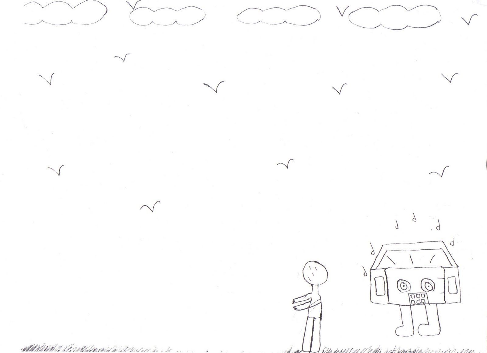
Craft: I chose the picture to portray the escape from an ordinary radio.I made these using the brush tool and the bucket to give it color. I drew the radio 88.3 on the left and the ordinary radio on the right.

Composition: The first picture I put a body on 88.3, but it has a guitar meaning 88.3 is much more an awesome than an ordinary radio.  On the other side you can see the ordinary radio is just standing there and look pretty down and bored. On the first picture you can't really see the trail at the bottom so in the second picture I made it much darker. One thing I do wish though was that my guitar looked much better and bigger like when I first drew it.

Concept: "The Escape From Ordinary radio is  88.3". When you look at the picture the trail is going from the ordinary radio going towards 88.3. The trail is the representation of escaping from the boring ordinary radio to the cool 88.3. 88.3 is larger than the other radio and more modern. It's a better representation of what the people like and how it connects to them. Without 88.3 people wouldn't be able to express themselves because no other radio can communicate to them as well as 88.3 can.

Week 10:Teapot Drawing


Craft: I used the brush tool from Photoshop in different sizes. I also used the pencil for digital drawing. I drew teapots that my professor brought in and put near our working space to visually look at and draw.  

Composition: I did lines back and forth kinda like scribbling to create the image of the teapots. The point of it wasn't to exactly draw the teapot but the outline with a whole bunch of lines that went from vertical to horizontal.

Concept: These images are various teapots drawn with vertical and horizontal lines with the basic colors black and white and with th bright colors yellow and red that help see the shape of the teapots.

Wednesday, March 23, 2011

Week 11: Drawing and Painting

Mixed Emotions!

Living in a Bubble !

The Sky and The Wind!

Music in the Air!

Chirping Birds!


Craft: I used different type of brushes to make this. What I did was use the brushes for example of a stamp and just did it over and over on one layer. I created many layers. I put some of the layers together to create these drawings that are weird yet I thought looked nice together.

Composition: I arranged things this way because it was part of the assignment to put these layers together even though they looked weird because they together they created a much better picture. I am controlling the viewers eye because when they first look at it they might see one thing but as they keep on looking at the picture they see other things hidden in the picture. The different colors also help in controlling the viewers eye.

Concept: My first Drawing I called "Mixed Emotions" because of the different designs in it like the music notes, the numbers, the objects that seem to be falling and it looks as if it had eyes watching you. It reminds me of when I over think too much and have all these types of thing on my mind. The second drawing I called "
'Living in a Bubble" because of the shaped bubble figures behind the numbers. The third drawing I called "The Sky and The Wind" because it reminds me of when the wind is blowing in your face and of the nighttime of the summer when your watching the stars. The fourth drawing I called "Music in the Air" because music is all around us. Without music life would be boring. Music can relate to us. The fifth drawing I called "chirping Birds". I called it that because the birds look like there chirping with there mouths open. The figures in the back remind me of grass or flowers where a bird might stand.

Sunday, March 13, 2011

Special Edition: Modern Art

Me outside the museum

Professor Nathan Peck

craft: This painting might seem like its all scribbles but it takes more time than most think. In order to paint this it takes different brushes, colors, and strokes to have completed this painting. If you look at this painting very closely more than twice you will always see something different and never the same. What I like about this painting is it's creativity.

Composition: I think the painter arranged things this way because they didn't think of any other way to arrange it but the first thing that came to mind. You can see how perfectly the colors blend in with outlines so you can the shape of the object. What I like about this picture are the colors because they looked like they were just splattered on there but it makes the painting very appealing. 

Concept: The concept of this painting I think is either a boy or a girl dancing. On the left i believe is a stick figure tree. So the boy or girl is dancing as they walk. What I like most about this painting is the bright lighting. it gives a huge emphasis on the stick figure. I'm sure when this first came out people were impressed because no one else had ever done something so simple yet so lovely.

Special Edition: Classical Art

Me outside the museum

Professor Nathan Peck

What I like about this picture is the textures for example like the mans shirt. He looks very serious with his collar up and his right eyebrow lifted up. You can see his face being red around some areas, his eyes look somewhat droopy, and the texture on his face shows some wrinkles. The colors in the back are neutral making the painting calm and serene. I think this painting is very interesting because it captures a man who has gone through a lot. I think that you can tell a lot from a persons face.

What I like about this picture is how the baby on the far left looks as if he has one eye closed. It seems as if his communicating with the other baby. The woman are dressed traditional like back in the old days. They all look down as it they were very thoughtful and had something on there minds.

This picture is like a night out of town for dinner with some friends. The lady on the right though looks scary. her face looks blue except for her brow bone and the bottom of the eyes. The people in the picture look like they are rich because of the way they are dressed and posed. What I like about this picture is the background and how the artist created the side slanted to make the room seem smaller.

Friday, March 11, 2011

week 8: 88.3 Is The Escape From Ordinary Radio


Craft: Based on what my professor told me I had to incorporate three things into these drawings. I used my pencil to sketch them out. Than I retraced with an ink pen and erased the pencil markings. With the ink pen I made my drawings much darker and better to understand.

Composition: The main focus on these drawings is how much more exciting and better to communicate to people the radio station 88.3 is. The viewer can see that 88.3 is being compared as a much better station than any other ordinary one.

concept: 3 drawings of 88.3 is the escape from ordinary radio. The first picture is a guy running away from an ordinary radio station heading towards 88.3. The second picture is an ordinary radio head on the right and on the left is 88.3 with the head as the radio and holding a guitar. 88.3 is the cool radio in this picture. The markings on the bottom are suppose to stand for the radio escaping or running. The third picture are two cars with different radio stations. The one on the right is 96.3 the ordinary radio and the one on the left is 88.3. You can see the little people escaping from the nonsense of the ordinary radio on the right and jumping onto the car on the left because thats where they want to be where ever 88.3 is.


Thursday, March 10, 2011

Week 7: Escaping From Ordinary Radio


Craft: I did these five sketches with my pencil than I went over it with a sharpie. I had to base these pictures of the concept escape from ordinary radio.

Composition: My first sketch shows someone listening to any old ordinary radio to something more modern which is the computer. The second one shows someone listening to 88.3 because it is far from ordinary than any other station. The third one is someone saying what they want because listening to 88.3 helps them be who they are. The fourth one is someone covering their ears because they rather listen to 88.3 than an ordinary radio station. The fifth one shows someone running away from an ordinary radio to a better one which is 88.3.
  
Concept: The whole point of these five sketches was "escape from ordinary radio". So my sketches show people escaping from ordinary radio moving on to something better.