Craft: I used about seven slides to create my video. I arranged the pictures in a way so that they would concur with each other. After creating my slides I went to animation and I added the slides I wanted at the bottom. I pressed the play button to watch my video until I was satisfied I arranged it the way I wanted it to look. Than I exported and rendered my video so I could put it on my desktop and watch it in larger view.
Composition: I decided to use my friends pictures that I had on my Lab top. I arranged the pictures so that they could make somewhat sense because they were taken with a webcam. When the viewer watches the video he or she will want to re watch it so he could get a glimpse at what they had missed previously.
Concept: The concept of this assignment was to create a video or slide on a idea of our choice.
Monday, May 2, 2011
Week 16: Final Video
The Attack of Ninaa
Craft: I used the pictures that my friend took on my webcam on my laptop. Using Photoshop I created about seven slides. Than I went to animation and added the slides that I wanted to use for my video. My video consists of parts of a face. Their are multiple eyes, mouths, you can see a double and a square face at the beginning.
Composition: When the viewer watches this video I think once they watch it the first time they will want to re watch it a couple more times to see something they might not have already seen the first time. You capture something knew every time you re watch it. I think people stay focused mainly on the first picture because it has multiple eyes that are just staring at you.
Concept: The concept of this assignment was to create a video based on a idea of our choice. I chose to it on my friend's pictures. This video contains weird pictures that my friend took with my laptop. I called the video The Attack of Ninaa because her big eyes are just staring at you ready to get you. Her face looks evil. She also looks like she has a double. Kinda like when your seeing things or your blind you can see double sometimes.
Monday, April 25, 2011
Week 14: Before & After Bike Lake

Before

After
Craft: I used Photoshop to make this two pictures. I used a couple layers to come up with something nice and simple. I used my bike brushes I had made from my previous assignment. I used the size assigned to us.
Composition: The elements that had to be used in these pictures had to be about bike that could of also consisted something about boys town, the Cubs, and soccer moms. My first picture I used a blue background like the lake, black handlebars, the black bike seats,and white dots that looked like water. For my after picture I decided to use bike wheels instead and make them white so their more noticeable and people can see them from far away. I also put the black bike seats. They look translucent. I kept the same blue background which is my water. One thing I kept in both pictures is "Bike Lake-view" at the bottom of the pictures.
Concept: The concept of this assignment was to create a picture for a poster that represented bike. It had to be simple and straight to the point. We had to use a certain size. The picture had to target a main purpose. Mine was the bike lake-view. I wanted people to know that if they saw my after picture in the street they would know their was a lake-view nearby and it was a place were you could use your bike because of the picture.
Friday, April 15, 2011
Week 13: Bike Pictures


Craft: I made these pictures with my brushes of bikes that I made.I incorporated different bike parts in the pictures. Some of the parts are in the background. These two pictures are really different but they both consist of the same things.
Composition: In the first picture I scribbled th background with an orange. Than I pasted different bike parts. In the back I put a wheel and on the right corner I put a big wheel. The main focus is the middle part i'm not sure what it's called but it's from a child's bike. Theres also several of these parts in the back. The main colors in this picture where oranges and yellows with black. The second picture has two big pedals, three bikes, the child's bike part like the first one and it has white handle bars. The background color I chose a blue green hue. The pedal at the top has the colors blue and white which I think is more appealing than the bottom one. There are also some white wheels on the sides of the picture. I think that both pictures catch the viewers eye with the really big bike part than you start looking at what is in the background or around it.
Concept: The concept of these pictures is Bike. Which picture looks more bike? I think that the one on the right is more bike because the pedals are really big and you know the pedals are from a bike and it has bikes in it to.
Week 12: Bike Brushes


Craft: These eleven brushes are all my own brushes I created. I made these brushes by first taking pictures the parts of bikes I had at home. I uploaded the pictures I wanted and I traced the bike part using the brush tool. When I was done tracing I used the paint bucket to add black and grey and create a better looking brush. The black and grey creates a better emphasis.
Composition: I tried tracing different parts of a bike not just the same one but in a different way. I traced wheel, a whole bike, handlebars, the part where the chain is on the bike, the bike seat, other wheels, and a pedal. I traced the pictures exactly how they were for example the bike seat has a black are on the lower right corner that is a rip that was on one of the bikes. One of the handle bars had some kind of strings to it i'm not sure what their for but I know it's an old bike.
Concept: The concept of this assignment was to create your own brushes that would be used to create pictures that will scream out "Bike" to the viewer.
Week 11: Random drawings


Craft: I did these two drawings using Photoshop's brushes to create something out of the ordinary. I made twenty different layers. On each layer I pasted the brushes over and over in different ways. Some were big some were mall. I also used the colors blue,green, white, and black in my pictures. I turned off all my layers and at the end I turned them all on to get something unusual. all the layers are on top of each other. In order to get something you like you have to move the layers up and down.
Composition: I am controlling the viewers eyes by the way I chose to arrange the layers in the pictures. I chose a layers for the first one with something that looked like it was moving in a way it reminds me of pine trees. It has blue music notes in the background that you can only see if you look closely. There are circle little object around the sides that remind me of bubbles. You can also see theres small little green squares everywhere that look like there falling down. The picture on the right is controlling the viewers eye by the large object right in the middle which is like a flower. You can see some hearts in the back and some music notes like the first picture had but their different. What I think catches a person eyes the most about this picture is the white sparkle. They look like twinkling stars.
Concept: The concept of this was to create different pictures using the same twenty layers. All you had to do was move the layers around. You also had to have constant colors from the same hues.
Friday, March 25, 2011
Week 9: Final Digital Pictures


Craft: I chose the picture to portray the escape from an ordinary radio.I made these using the brush tool and the bucket to give it color. I drew the radio 88.3 on the left and the ordinary radio on the right.
Composition: The first picture I put a body on 88.3, but it has a guitar meaning 88.3 is much more an awesome than an ordinary radio. On the other side you can see the ordinary radio is just standing there and look pretty down and bored. On the first picture you can't really see the trail at the bottom so in the second picture I made it much darker. One thing I do wish though was that my guitar looked much better and bigger like when I first drew it.
Concept: "The Escape From Ordinary radio is 88.3". When you look at the picture the trail is going from the ordinary radio going towards 88.3. The trail is the representation of escaping from the boring ordinary radio to the cool 88.3. 88.3 is larger than the other radio and more modern. It's a better representation of what the people like and how it connects to them. Without 88.3 people wouldn't be able to express themselves because no other radio can communicate to them as well as 88.3 can.
Week 10:Teapot Drawing


Craft: I used the brush tool from Photoshop in different sizes. I also used the pencil for digital drawing. I drew teapots that my professor brought in and put near our working space to visually look at and draw.
Composition: I did lines back and forth kinda like scribbling to create the image of the teapots. The point of it wasn't to exactly draw the teapot but the outline with a whole bunch of lines that went from vertical to horizontal.
Concept: These images are various teapots drawn with vertical and horizontal lines with the basic colors black and white and with th bright colors yellow and red that help see the shape of the teapots.
Wednesday, March 23, 2011
Week 11: Drawing and Painting
 |
| Mixed Emotions! |
 |
| Living in a Bubble ! |
 |
| The Sky and The Wind! |
 |
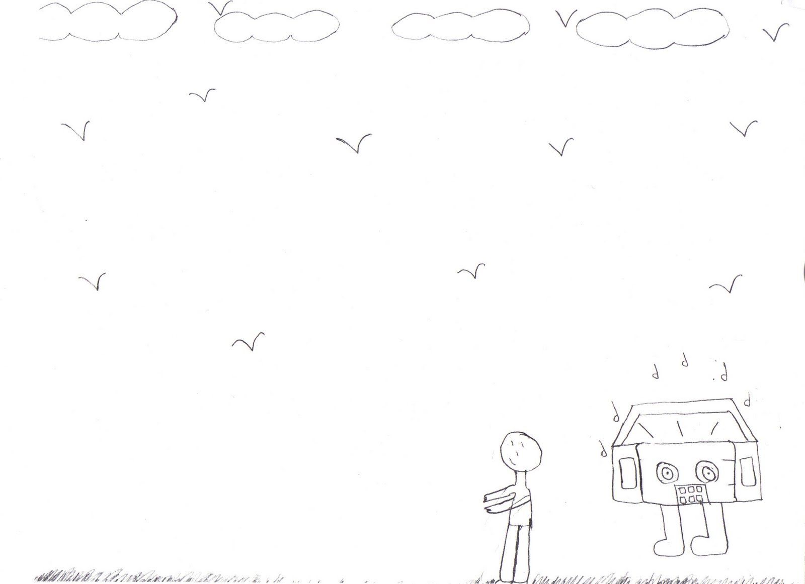
| Music in the Air! |
 |
| Chirping Birds! |
Craft: I used different type of brushes to make this. What I did was use the brushes for example of a stamp and just did it over and over on one layer. I created many layers. I put some of the layers together to create these drawings that are weird yet I thought looked nice together.
Composition: I arranged things this way because it was part of the assignment to put these layers together even though they looked weird because they together they created a much better picture. I am controlling the viewers eye because when they first look at it they might see one thing but as they keep on looking at the picture they see other things hidden in the picture. The different colors also help in controlling the viewers eye.
Concept: My first Drawing I called "Mixed Emotions" because of the different designs in it like the music notes, the numbers, the objects that seem to be falling and it looks as if it had eyes watching you. It reminds me of when I over think too much and have all these types of thing on my mind. The second drawing I called "
'Living in a Bubble" because of the shaped bubble figures behind the numbers. The third drawing I called "The Sky and The Wind" because it reminds me of when the wind is blowing in your face and of the nighttime of the summer when your watching the stars. The fourth drawing I called "Music in the Air" because music is all around us. Without music life would be boring. Music can relate to us. The fifth drawing I called "chirping Birds". I called it that because the birds look like there chirping with there mouths open. The figures in the back remind me of grass or flowers where a bird might stand.
'Living in a Bubble" because of the shaped bubble figures behind the numbers. The third drawing I called "The Sky and The Wind" because it reminds me of when the wind is blowing in your face and of the nighttime of the summer when your watching the stars. The fourth drawing I called "Music in the Air" because music is all around us. Without music life would be boring. Music can relate to us. The fifth drawing I called "chirping Birds". I called it that because the birds look like there chirping with there mouths open. The figures in the back remind me of grass or flowers where a bird might stand.
Sunday, March 13, 2011
Special Edition: Modern Art
 |
| Me outside the museum |
 |
| Professor Nathan Peck |

craft: This painting might seem like its all scribbles but it takes more time than most think. In order to paint this it takes different brushes, colors, and strokes to have completed this painting. If you look at this painting very closely more than twice you will always see something different and never the same. What I like about this painting is it's creativity.


Concept: The concept of this painting I think is either a boy or a girl dancing. On the left i believe is a stick figure tree. So the boy or girl is dancing as they walk. What I like most about this painting is the bright lighting. it gives a huge emphasis on the stick figure. I'm sure when this first came out people were impressed because no one else had ever done something so simple yet so lovely.
Special Edition: Classical Art
|
| Me outside the museum |
 |
| Professor Nathan Peck |

What I like about this picture is the textures for example like the mans shirt. He looks very serious with his collar up and his right eyebrow lifted up. You can see his face being red around some areas, his eyes look somewhat droopy, and the texture on his face shows some wrinkles. The colors in the back are neutral making the painting calm and serene. I think this painting is very interesting because it captures a man who has gone through a lot. I think that you can tell a lot from a persons face.

What I like about this picture is how the baby on the far left looks as if he has one eye closed. It seems as if his communicating with the other baby. The woman are dressed traditional like back in the old days. They all look down as it they were very thoughtful and had something on there minds.

This picture is like a night out of town for dinner with some friends. The lady on the right though looks scary. her face looks blue except for her brow bone and the bottom of the eyes. The people in the picture look like they are rich because of the way they are dressed and posed. What I like about this picture is the background and how the artist created the side slanted to make the room seem smaller.
Friday, March 11, 2011
week 8: 88.3 Is The Escape From Ordinary Radio


Craft: Based on what my professor told me I had to incorporate three things into these drawings. I used my pencil to sketch them out. Than I retraced with an ink pen and erased the pencil markings. With the ink pen I made my drawings much darker and better to understand.
Composition: The main focus on these drawings is how much more exciting and better to communicate to people the radio station 88.3 is. The viewer can see that 88.3 is being compared as a much better station than any other ordinary one.
concept: 3 drawings of 88.3 is the escape from ordinary radio. The first picture is a guy running away from an ordinary radio station heading towards 88.3. The second picture is an ordinary radio head on the right and on the left is 88.3 with the head as the radio and holding a guitar. 88.3 is the cool radio in this picture. The markings on the bottom are suppose to stand for the radio escaping or running. The third picture are two cars with different radio stations. The one on the right is 96.3 the ordinary radio and the one on the left is 88.3. You can see the little people escaping from the nonsense of the ordinary radio on the right and jumping onto the car on the left because thats where they want to be where ever 88.3 is.
Thursday, March 10, 2011
Week 7: Escaping From Ordinary Radio


Craft: I did these five sketches with my pencil than I went over it with a sharpie. I had to base these pictures of the concept escape from ordinary radio.
Composition: My first sketch shows someone listening to any old ordinary radio to something more modern which is the computer. The second one shows someone listening to 88.3 because it is far from ordinary than any other station. The third one is someone saying what they want because listening to 88.3 helps them be who they are. The fourth one is someone covering their ears because they rather listen to 88.3 than an ordinary radio station. The fifth one shows someone running away from an ordinary radio to a better one which is 88.3.
Concept: The whole point of these five sketches was "escape from ordinary radio". So my sketches show people escaping from ordinary radio moving on to something better.
Thursday, February 24, 2011
Week 6: Final Pictures


Craft: The assignment was to fix the pictures from our previous one from the help of my classmates. I made two changes to the two pictures.
Composition: In order to make make these pictures better than the first ones, I made the pictures brighter looking so you can see the colors more vibrant. I made the nails overlap each other more without leaving any gaps. Now you cant see any black in the background.
Concept: Now the pictures reflect a better understanding of what I tried doing the first time. The concept of these pictures is the same as my first ones which is pretty much anything can be turned into something else and you might not even know exactly what it is even if you try to guess until you are told what it is you. You might not believe what you are told because its crazy how one thing can be turned into another picture creating more and more art.
Friday, February 11, 2011
Week 5
 |
Craft: I made this picture from another picture of nails. I cut out this one nail, copied it and pasted many of this. I stretched them out and made them wider. I also overlapped them. Composition: I arranged these nails overlapping to make them look different from the first ones. They look as if they are rotating in a circle. They first line goes from small to big and the second line goes from small to big. The first thing I think the viewers see is the white lines than they focus on the flowers and the bright colors. Concept: This is a nail. It means art is everywhere even were you don't expect it. I believe art can come in various ways and one of those is being artistic when you get your nails done. |
Subscribe to:
Comments (Atom)